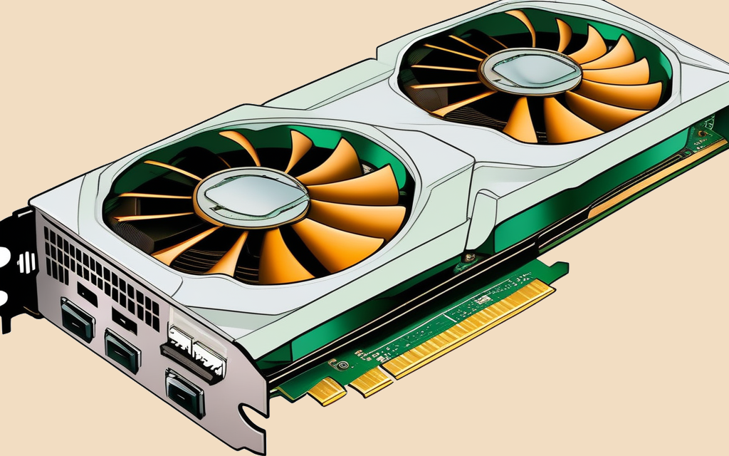
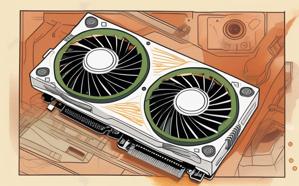
The reading layer over my news pipeline. Every illustration is generated locally in about five seconds, on the same GPU that runs the models.
Method
DesignData
Topic
MediaSocietyScience & Tech
The News Intelligence Dashboard is the reading layer over my local news pipeline: Stable Diffusion cover art, a D3 globe and a knowledge graph. Each design choice is judged by how fast a reader can trust the output.
The prompt's scene sets the style of local cover art
Both covers came off the same GPU and model in the same five seconds. Only the scene the prompt asked for differs.
Stable Diffusion 1.5 runs as a 1.6 GB quantized GGUF on the RTX 5070 Ti that runs the pipeline.
Stock photography makes every brief look like every other aggregator.
A vision model first turns each headline into a concrete scene.
A second vision model for quality control rejects roughly two thirds, good covers included, so every batch is checked by hand.
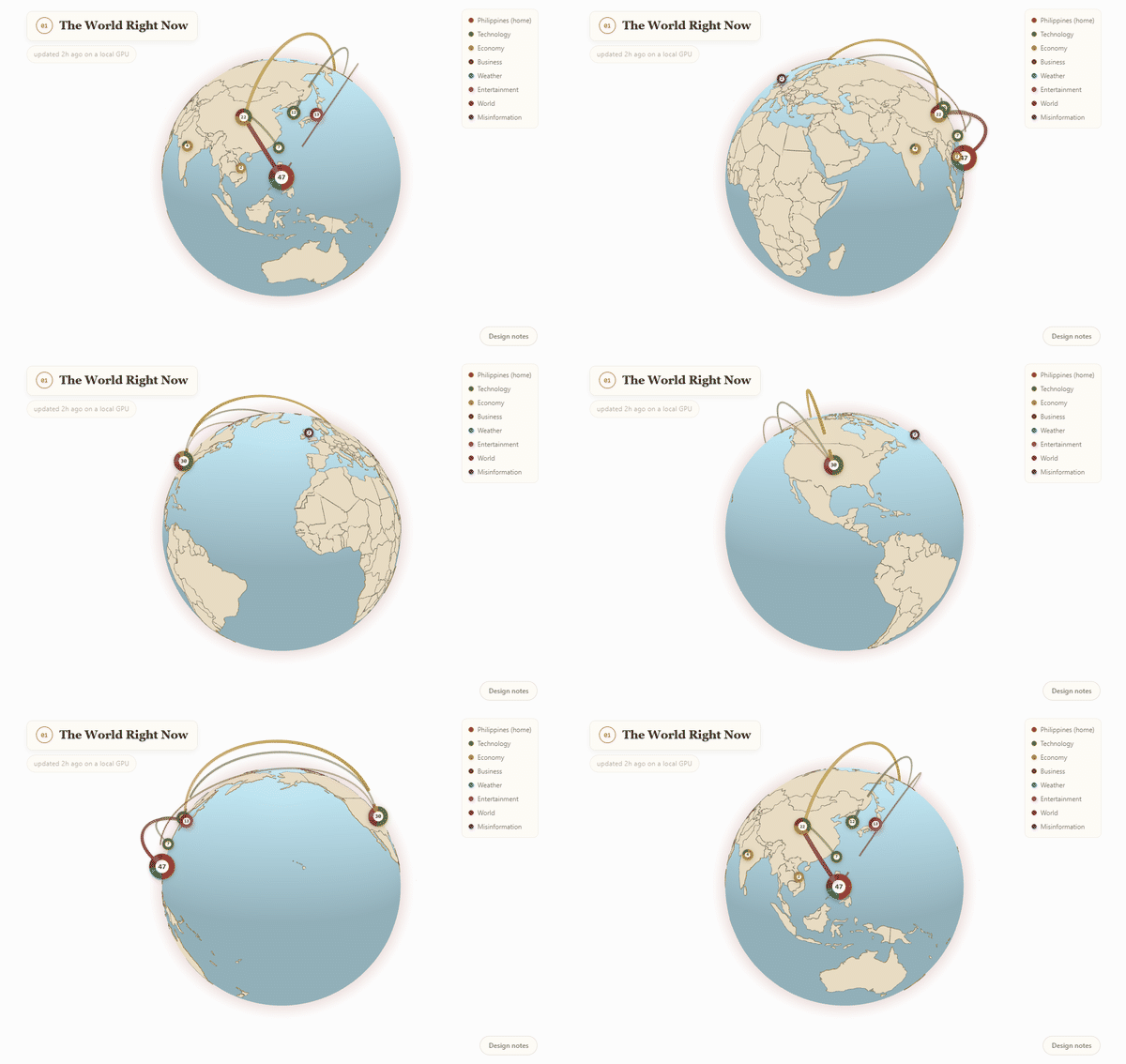
The globe in the dashboard, one donut per country sized by coverage, with arcs between countries in the same story
Each country on the globe is a donut sized by coverage
A single dot per country, coloured by topic, forces each country into one category it does not have.
Each dot is sized by current coverage and drawn as a donut, so a country in three topics looks like three topics.
Arcs join countries that appear in the same story, with arc height tracking real distance.
A chord diagram is more compact, but where a story happens is part of what a news tool means.
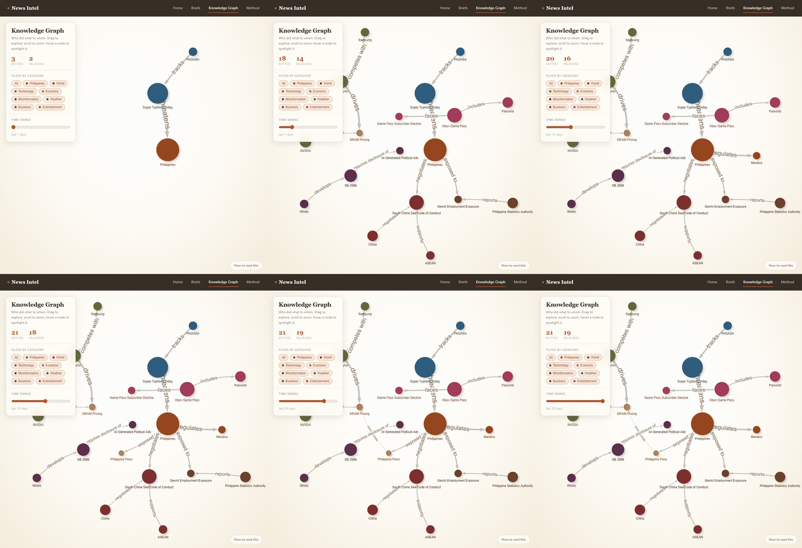
The knowledge graph filling in as the time range widens, starting from a single typhoon tracked by PAGASA and threatening the Philippines
The knowledge graph builds up as the time range widens
Entities and relations fade in as their timestamps enter the selected window.
Every edge is a subject-predicate-object triple from the pipeline's own extractor.
Shared screenshots show institutional and economic stories only.
Freshness is drawn, because a three-day-old relation and a three-week-old one should not look the same.